Subsections
6.2 Removing Color Casts
A color cast occurs when the Red, Green, and Blue channels of an image
are not properly balanced. The cast can be across the entire range of
pixel values or can limit itself to the highlight, shadow, or midtones
of the image. Color casts are common in photographs. They occur
because, under certain circumstances, the sensitivity of film to color
is different than the sensitivity of the human eye. The film just
doesn't record the same scene as your eye.
Removing color casts requires being able to identify where the color
in an image has gone wrong. I often have a hard time telling, simply
by looking at an image, if it is suffering from a color cast. This is
due to many reasons. First, color is a perceptual issue that is
strongly affected by surrounding light conditions. Second, the
representation of color varies from one computer monitor to another
because settings such as brightness, contrast, gamma, and color
temperature can be quite different. Furthermore, the ability of a
monitor's phosphors to create levels of red, green, and blue light
will differ from monitor to monitor and change over time as the
monitor ages.
All this makes the perceptual evaluation of color casts difficult for
the average person. Fortunately, the GIMP provides some analytical
and interactive tools for determining whether color casts exist and
for correcting them. There are several techniques for identifying,
measuring, and correcting color casts. Each approach uses the
powerful Curves tool which is reviewed in the first part of this
section.
6.2.1 The Curves Tool
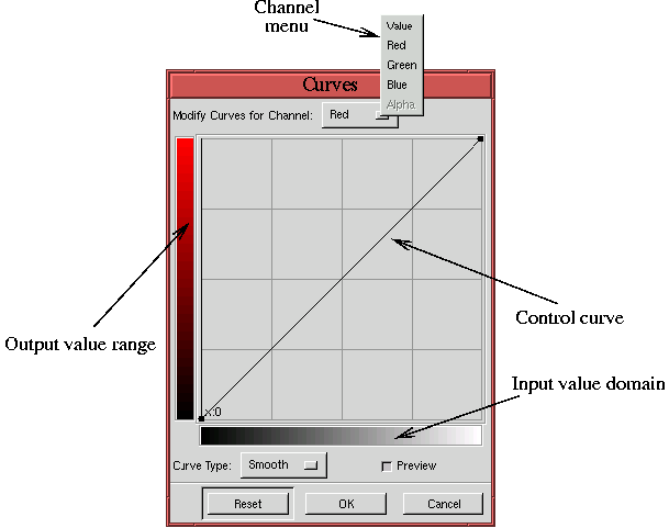
The Curves tool is found in the Image:Image/Colors menu.
Figure
6.8
Figure 6.8:
The Curves Tool
 |
illustrates the basic components of this tool. As with the
Levels tool, the
Curves tool can be applied to any of five
different channels; however, for removing color casts, we are mainly
concerned with the Red, Green, and Blue channels.
The main elements of the tool consist of an input value
domain, an output value
range, and a control
curve drawn on a graph. The graph has a grid
divided into quarters, and the range of values is from 0 to 255.
Thus, the value of each grid line, moving horizontally from left to
right, is 0, 64, 128, 192, and 255. The values moving vertically from
bottom to top are the same.
The control curve represents a map of the input value domain to the
output value range. That sounds pretty abstract! What good is
mapping input to output values? The executive, top-level answer is
that curve mapping of input to output values is the most powerful
color correcting tool in the GIMP, and learning how to use it is
definitely worth your while. More about mapping input to output
values and what it's good for in a moment...
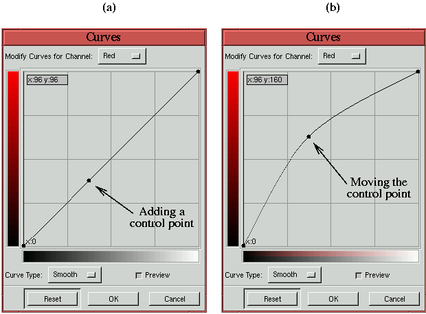
Figure
6.9
Figure 6.9:
Adding and Moving a Control Point
 |
illustrates the main operation we will be performing with the
Curves tool--that is, adding a
control point to the control curve as in
Figure
6.9(a) and then moving it to a new position
as in Figure
6.9(b). Control points can be added
to the curve simply by clicking on the curve at the desired location.
The point can be moved by clicking and dragging it. If the mouse
cursor is not on the curve when the mouse button is clicked, a control
point is added to the curve at the position directly above (or below)
the cursor. This new point is then automatically positioned to the
cursor location.
Every control curve has two default control points located at the
curve's upper right and lower left. These can be moved just like
user-created control points. All control points except the defaults
can be removed by clicking on the Reset button in the dialog. If many
control points have been positioned and a single one needs to be
removed you can remove it by dragging it with the mouse to the left or
right edge of the dialog. This pulls the control point right off the
curve.
The Curves tool also has an Information Field that interactively
indicates the X and Y positions of the mouse cursor whenever it is in
the graph area of the dialog. This field is located in the upper-left
corner of the graph area, and, as you will see, this information is
essential for performing precise color correction. But first, it is
important to get an intuitive feel for how the Curves tool
works.
Figure
6.10
Figure 6.10:
Image with Shadow-to-Midtone and Midtone-to-Highlight Gradients
 |
illustrates a special test case that will help you understand how the
Curves tool affects an image. The figure shows two gradients
each using up half the tonal range of a grayscale. The upper gradient
has values from 0 to 127, and the lower gradient has values from 128
to 255.
The following illustrates how the Curves tool is used to change
the tonal range of these two gradients.
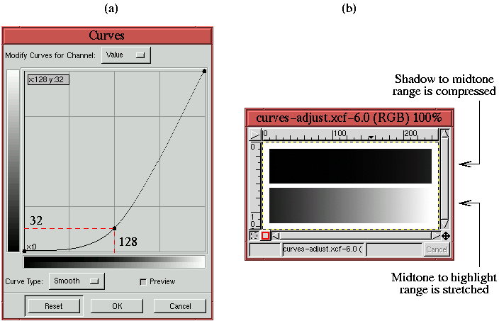
Figure
6.11(a)
Figure 6.11:
Improving the Contrast of the Midtone-to-Highlight Gradient
 |
shows the Value channel of the
Curves tool. A control point has
been placed at the midpoint of the curve and pulled downward to a
position one quarter of its original height. Initially, when it is a
straight line, the curve of the
Curves tool maps each input
value to the identical output value. However, the curve shown in
Figure
6.11 changes that map. Now the input
values from 0 to 128 are mapped to one quarter of the scale they were
before. That is, these values are now compressed into the range of 0
to 32. At the same time, the input values in the domain 128 to 255
are stretched to the range of 32 to 255. This is emphasized by the
red dashed lines superimposed on the
Curves dialog.
This means that all the pixels that had values in 0 to 128 in
Figure
6.10 are compressed to a new range of
0 to 32. Thus, much of the detail and contrast between neighboring
pixel values in this range is lost. This effect can clearly be seen
in the upper gradient in Figure
6.11(b),
which is the result of applying the curve in
Figure
6.11(a) to the image in
Figure
6.10. Simultaneously, the pixel
values in the domain 128 to 255 are stretched to a new range of 32 to
255. Consequently, the contrast of the detail of these pixels is
increased, as you can see in the lower
gradient in Figure
6.11(b).
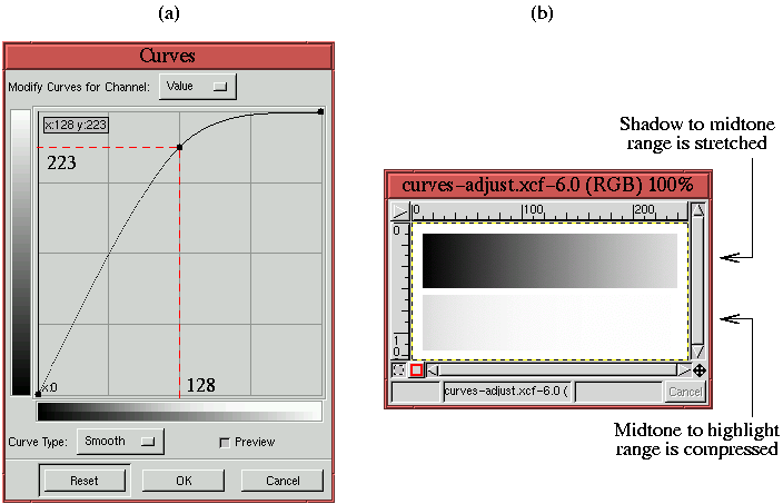
A similar analysis can be made for
Figure
6.12,
Figure 6.12:
Improving the Contrast of the Shadow-to-Midtone Gradient
 |
which illustrates the opposite effect. Here, as shown in
Figure
6.12(a), the input value domain from
0 to 128 is stretched and the input domain from 128 to 255 is
compressed. The effect on the gradients is shown in
Figure
6.12(b). Although these two examples
are illustrated using the Value channel, the same conclusions hold for
the Red, Green, and Blue channels.
The conclusion that can be drawn from these two examples is that the
Curves tool can be used for two things. First, ranges of pixel
values can be remapped. This is particularly
valuable when a color channel is out of balance with the others. When
color imbalances occur, we will try to measure which range is out of
balance, determine what the range should be, and use the Curves
tool to remap one range to the other. This approach is developed in
detail in Section
6.2.2.
The second use is to improve contrast where it is most needed. Often
an image has a subject that is much more important than the rest of
the image. When this is the case, it is desirable to give the subject
the most detail and contrast possible. From the examples, you can see
that the Curves tool can be used to improve contrast. Note,
however, that in improving the contrast in one range of values, there
must simultaneously be a loss of detail and contrast in the
complementary range of values. This was clearly demonstrated in
Figures
6.11(b) and
6.12(b). Fortunately, improving the
contrast of the subject while simultaneously impoverishing the
contrast of the background is typically what we want to do. This
draws the viewer's eye to the part of the image we most want to
convey. The idea of improving subject contrast is developed more in
Section
6.2.6.
