9.5.4 What Is the Best Choice?
Given that the designer chooses to limit the color palette to one
that is web-safe, converting to Indexed format still requires making
choices about the type of color distortion that is acceptable when it
can't be avoided. Usually the choice depends on the type of image to
be displayed.
If the image is a photograph, or one that has smooth color variations,
chances are good that there are more than 256 colors in the image, and
many will not be from the web-safe palette. Normally the color
distortion to photos on an 8-bit display is not noticeable, and it
could be argued that it is fruitless to convert the image to an
Indexed format under these conditions. However, when photographs are
mixed with other graphic materials the argument is no longer valid.
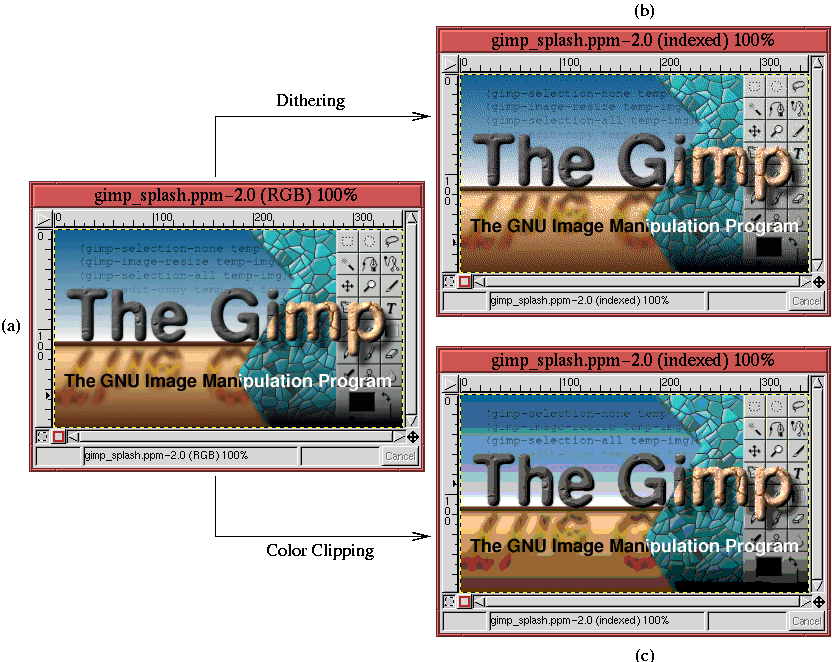
Under these circumstances, the best choice is to dither. This is
illustrated in Figure
9.28.
Figure 9.28:
Choosing the Type of Color Distortion for Images with Smooth Color
Variations
 |
Figure
9.28(a) shows a splash screen used with
version 1.0.4 of the GIMP. A dithered version of the splash screen,
obtained using the web-safe color palette, is shown in
Figure
9.28(b). A color clipped version of the
splash screen using the same palette is shown in
Figure
9.28(c). Due to the heavy banding seen
in Figure
9.28(c), the color distortion due to
dithering, seen in Figure
9.28(b), seems much
more acceptable. This example shows that for images with smoothly
varying color, the dithered solution is better because
clipping
gives rise to a strongly objectionable color distortion.
If the image is not a photograph and does not have smoothly varying
variations in color but rather large regions of constant color, the
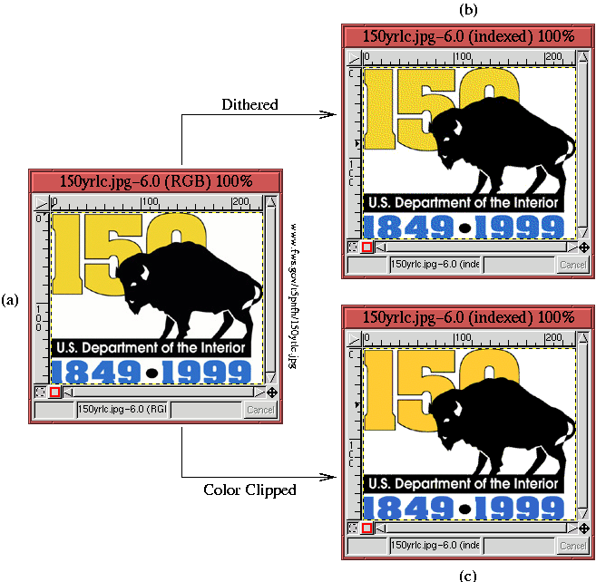
strategy is completely different. This is illustrated in
Figure
9.29.
Figure 9.29:
Choosing for Images with Large Uniform Color Regions
 |
Figure
9.29(a) shows a graphic design
celebrating the

anniversary of the creation of the
U.S. Department of the Interior. This design is constructed of four
main colors: black, white, a blue consisting of
46
R 110
G 207
B,
and a yellow consisting of
241
R 214
G 47
B. There are other colors
in the image, but they are there for antialiasing
(see Section
3.1.2) and sharpness (see
Section
6.4.1). From the previous discussion, you can
see that the blue and the yellow are not from the web-safe palette,
which only take RGB components from the set of values
[0, 51, 102,
153, 204, 255]. This means that some color distortion will be
introduced if the image is saved to Indexed format with the web-safe
palette. Indeed, Figure
9.29(b) shows the
result of applying Floyd-Steinberg dithering, and
Figure
9.29(c) shows the result of color
clipping.
The dithering in Figure
9.29(b) produces a very
undesirable effect. The blue and yellow regions both suffer from
unsightly color speckle. On the other hand, the color clipped version
in Figure
9.29(c) produces a blue and a yellow
that are slightly different than those of the original. Nevertheless,
it is likely that this result is preferable because it preserves the
homogeneity of the large, uniform color regions.
In conclusion, images that have a lot of detail and subtle color
variations are better served by dithering than color clipping.
Alternatively, images that have broad uniform color regions should
avoid dithering and use color clipping. For images that consist of a
mix of the two conditions, some experimentation is necessary.
Unfortunately there are sometimes no easy choices.
©2000 Gimp-Savvy.com
