3.1.2.1 Antialiasing
Antialiasing is an important edge treatment for selections.
Figure
3.11
Figure 3.11:
How Antialiasing Works
 |
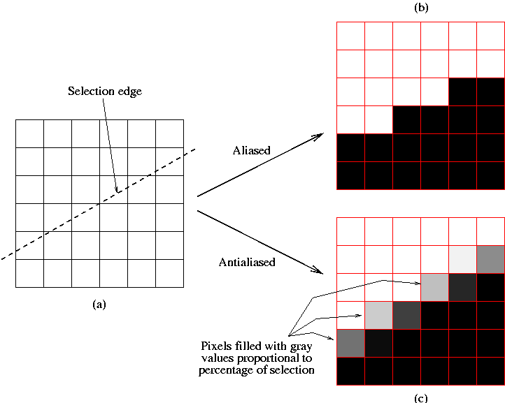
illustrates the antialiasing concept.
Figure
3.11(a) shows an array of pixels that
has been partitioned into two regions by a selection edge. However,
due to the slope of the selection and the finite area of the pixels,
some pixels are on both sides of the selection edge. That is, these
pixels are only partially selected. What happens to this set of
partially selected pixels is important for the aesthetic presentation
of the selection's edge.
For example, let's assume that white represents a selected pixel and
black an unselected one. Figure
3.11(b)
shows what happens if pixels are included in the selection when more
than 50% of the pixel is above the selection edge and unselected
otherwise. This seems like a reasonable criterion, however, notice
that the selection edge obtained by applying this rule produces a
staircase effect on the edge. This staircase effect, known as aliasing, makes the edge look harsh. We'll see this
in a more realistic example in a moment.
Alternatively, Figure
3.11(c) illustrates the
concept of antialiasing. Here white represents a pixel which is fully
selected, black one that is fully unselected, and gray represents
partially selected pixels, where the level of gray indicates the
percentage of the pixel that falls inside the selection. Thus, a
lighter value of gray indicates a more fully selected pixel and a
darker value a less selected one. Assigning gray values to partially
selected pixels has the effect of visually smoothing the staircase
effect illustrated in Figure
3.11(b), which
is why this is called antialiasing.
The way antialiasing is actually implemented is by using the layer's
alpha channel. Alpha channels
were introduced in Section
2.2 and a more
comprehensive presentation of them is given in Chapters
4
and
5. However, for the purposes of discussing
antialiasing it is sufficient to know that the white pixels in
Figure
3.11(c) represent pixels that are
fully opaque, the black pixels those that are fully transparent, and
the gray pixels those that are partially opaque (or transparent).
Figure
3.12
Figure 3.12:
A Practical Example of Using Antialiasing
 |
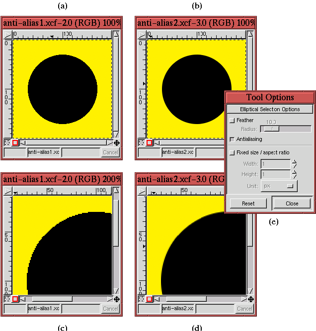
illustrates a more realistic example of aliased and antialiased
pixels. Figures
3.12(a) and (b) each show a
circle created using the
Ellipse Select tool. For both, the
selections were filled with black using the
Bucket
Fill tool. The selection made in part (a) of
the figure was made without antialiasing, and that in part (b) with.
From these two figures it can immediately be seen that the antialiased
circle seems to have a much smoother edge.
Figures
3.12(c) and (d) show zoomed versions
of Figures
3.12(a) and (b). The staircase
effect can be clearly seen in
Figure
3.12(c). Alternatively, in
Figure
3.12(d) there are black, edge pixels
that are partially transparent and that allow part of the yellow
background to show through. Figures
3.12(b)
and (d) demonstrate that antialiasing really does improve the
aesthetic appearance of the selection edge.
Figure
3.12(e) shows that the Antialiasing
checkbox in the Tool Options dialog for the Ellipse Select
tool is toggled on for Figures
3.12(b) and
(d). For all the selection tools, Antialiasing is on by default.
As a final remark, note that the Rectangle Select tool does not
have an antialiasing option. This is normal because this selection tool
can never produce sloping edges. Consequently, the staircase problem
illustrated in Figure
3.11 can never occur,
and antialiasing is not needed.
