7.3 Project 3: Destination Saturn
The third project creates a collage that blends together a terrific
photo of the planet Saturn with a launch of the space shuttle. This
project illustrates a more sophisticated use of layer masks and blend
modes.
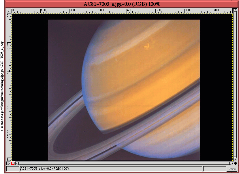
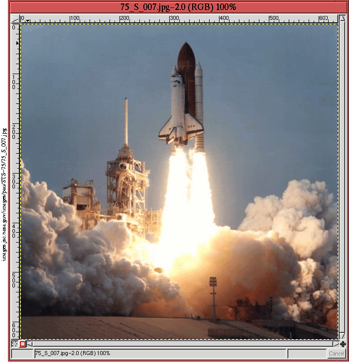
The raw images for the project are shown in
Figures
7.17
Figure 7.17:
Original Image of Saturn
 |
and
7.18.
Figure 7.18:
Original Image of Shuttle Launch
 |
The objective is to depict the shuttle lifting off with Saturn sitting
majestically in the background...perhaps as a final destination?
Although the space shuttle was never conceived for travel to Saturn,
the GIMP allows us to imagine, suggest, even portray the
inconceivable.
The rough layout of the desired scene is to position the image of
Saturn somewhat above and behind the shuttle lift-off. The first step
is to get the two images into the same window. For this, a little
planning is necessary. The image of Saturn is wider than that of the
shuttle. However, the Saturn image has a large black margin that,
when cropped, will make the result narrower than the shuttle.
Cropping the Saturn image to remove the black margin produces an image
that has a width of 527 pixels and a height of 489 pixels. The raw
space shuttle launch image has a width of 640 pixels and a height of
636 pixels.
Considering the rough layout discussed earlier the width of the
shuttle image must be cropped to that of the Saturn image, 527 pixels.
Furthermore, I decided that the lower 130 pixels of the shuttle image
won't be used, meaning that the height of the shuttle image after
cropping will only be 506 pixels. There needs to be some vertical
overlap between the two layers in the composited image, so I chose a
total vertical height of 750 pixels. The Crop tool is used to
nicely center the shuttle launch image while producing the desired
dimensions.
The two raw images are now ready to be united into a single image. A
new window is created by typing C-n in the Saturn image window.
When the New Image dialog appears, the default values for the
width and height are those of the Saturn image, 527 by 489. The value
of 750 pixels is entered into the height field, and when the new
window is created, it has the desired dimensions of 527 by 750.
The shuttle launch image is now copied and pasted into the new image
window. This is done by typing C-c in the shuttle launch window
followed by C-v in the new window. The result places the
shuttle image into a floating selection that can be seen by opening
the Layers dialog (that is, by typing C-l in the image window).
The Move tool is used to position the shuttle
to the bottom of the window; it is then anchored to the background by
clicking on the Anchor button in the Layers dialog.
Creating a new layer by clicking on the New Layer button in the
Layers dialog, the image of Saturn is now copied to the new image
window, slid to the top of the window using the Move tool, and
finally anchored into the newly created layer. Double-clicking on
each layer in the Layers dialog allows us to name each one. The top
layer is named Saturn, and the lower layer is named Shuttle Launch.
The result is shown in Figure
7.19(a)
Figure 7.19:
Assembling the Pieces
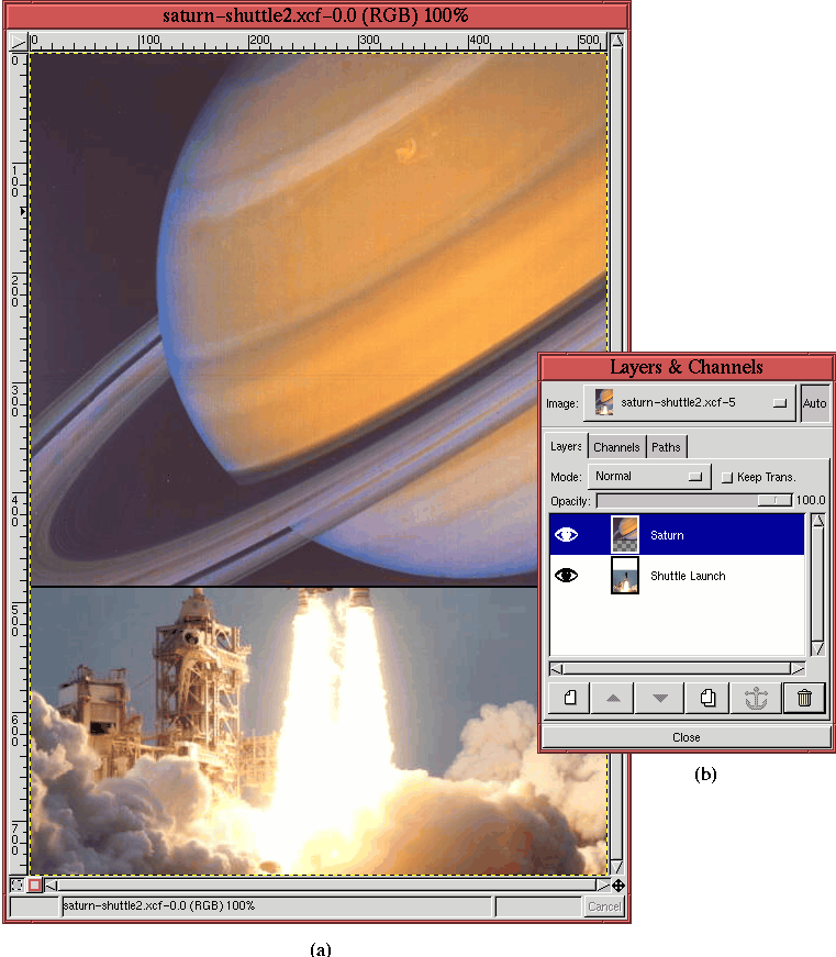 |
which shows the Saturn layer half blocking the Shuttle Launch layer.
The Layers dialog is shown in
Figure
7.19(b).
Now that the two images are positioned, one approach for blending the
two is to use the layer mask and gradient technique described in
Section
4.3.3. The idea is to create a layer mask
for the Saturn layer and to blend the two layers together by applying
a gradient in the layer
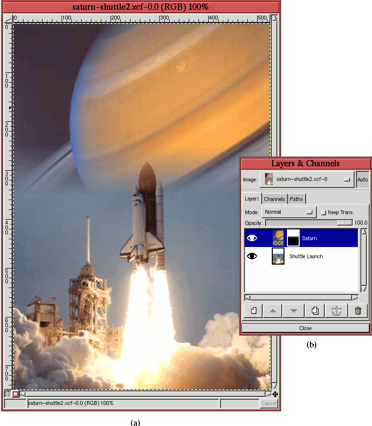
mask. This produces the image shown in
Figure
7.20(a).
Figure 7.20:
A First Attempt to Blend the Shuttle Launch and Saturn Layers
 |
Figure
7.20(b) shows how a layer mask
with a gradient has been added to the Saturn layer.
Figure
7.20 is a blend of the two
layers, but in many ways it misses the mark. The blend of the two
images shows the shuttle against the background of Saturn, however,
the lower part of the ringed planet is covered by the blue sky
background of the shuttle launch image. This doesn't look natural,
and it would be nice to keep the shuttle and launch vehicle equipment
well defined while simultaneously blending the background into the
Saturn image in a more delicate manner. Fortunately, this can be
accomplished using a very clever masking technique adapted from
[10].
The idea is to combine two masks into one using a blending mode. The
first mask is made from the shuttle and launch equipment, and the
second mask is made from a gradient. The two masks are combined using
the Darken Only blending mode . Read on!
The implementation of the idea requires a mask of the shuttle
equipment. The mask is made using the Decompose and Threshold technique described in
Section
4.5.3. The Decompose function with the HSV option is used
to create a hue, saturation, and value decomposition of the Space
Shuttle layer. On inspection of the result, the Hue channel seems to
have the most potential for a simple separation of the subject from
its background. The Threshold tool is used on
the Hue channel, and when the best threshold range has been determined
and some cleanup has been performed using the Lasso tool, the
result is as shown in Figure
7.21.
Figure 7.21:
Creating a Mask of the Space Shuttle Layer
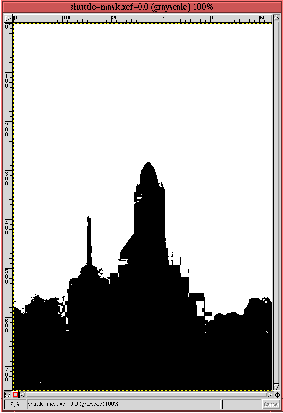 |
This black and white image is not a perfect mask, but some of the
defects will be removed in a moment, and the rest will not matter.
The next step is to copy and paste the grayscale image from
Figure
7.21 into the layer mask of the
Saturn layer in Figure
7.20. This is
done as follows:
- 1.
- The layer mask of the Saturn layer is made active by clicking on its
thumbnail in the Layers dialog,
- 2.
- The grayscale image in Figure
7.21 is
copied into the default buffer by typing C-c in its image
window.
- 3.
- The contents of the buffer are then pasted into the image
of Figure
7.20 by typing C-v in
its image window.
- 4.
- This creates a floating selection that is then dropped into the layer
mask by clicking on the Anchor button in the Layers dialog.
At this point, the layer mask is cleaned up using the Airbrush tool. The technique is described in
detail in Section
4.5.1 for a channel mask. Here, the
method is applied to a layer mask. To facilitate the cleanup the
opacity of the Saturn layer is adjusted using the Opacity slider in
the Layers dialog.
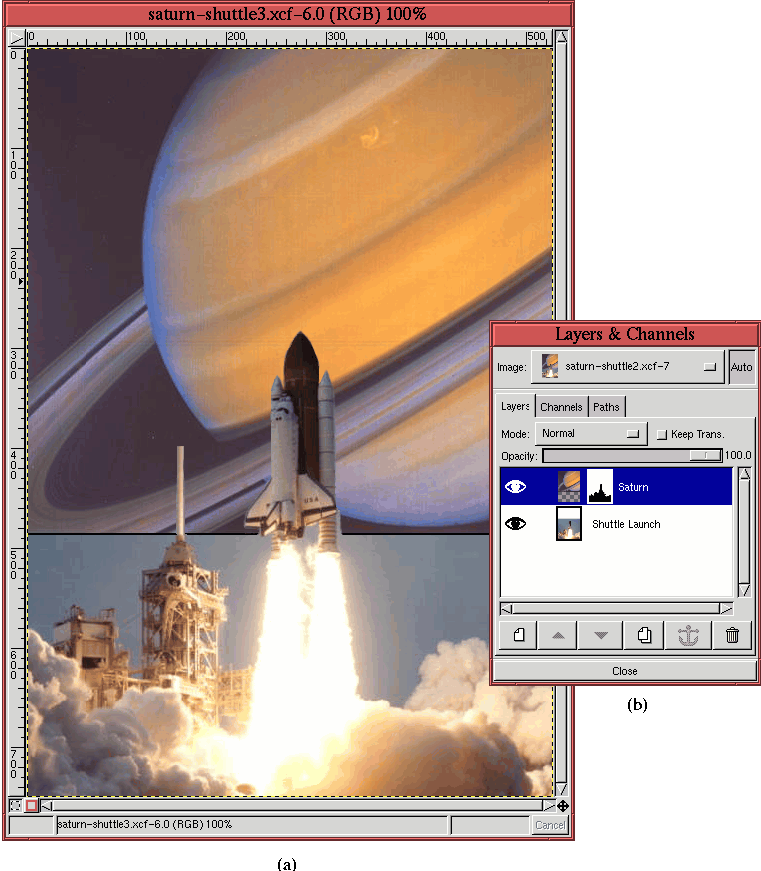
The resulting layer mask allows the shuttle and launch equipment to be
seen through the Saturn layer. The state of the project is shown in
Figure
7.22(a), and
Figure 7.22:
Application of the Space Shuttle and Launch Equipment Layer Mask
 |
Figure
7.22(b) shows the thumbnail of
the resulting layer mask in the Layers dialog.
Figure
7.22(a) is almost what we're
looking for. To finish, the boundary between the two layers should be
blended with a gradient similar to the one in
Figure
7.20(a), but without disturbing
any part of the masked shuttle and launch equipment.
This final touch is achieved by applying a gradient to the layer mask
using the Darken Only blending
mode. As described in Section
5.6.4, this mode
combines foreground and background pixels by retaining the darker of
the two. Thus, a gradient applied using the Darken Only mode
only changes the layer mask where the gradient is darker than the
mask. This is just what we are looking for. The shuttle and launch
equipment will not be affected by the gradient because these parts of
the mask are already black...can't get any darker than that!
Let's see how it works. To apply the gradient to the layer mask, the
following steps are used:
- 1.
- The layer mask of the Saturn layer is made active by clicking on its
thumbnail in the Layers dialog.
- 2.
- A linear FG to BG (RGB) gradient is chosen from the Gradient
tool options dialog.
- 3.
- The Active Foreground Color is set to black, and the Active
Background Color is set to white by typing d in the image
window.
- 4.
- The blending mode is set to Darken Only in the Brush
Selection dialog.
- 5.
- A gradient is applied to the layer mask by clicking in the image
window just above the lower edge of the Saturn layer
and dragging vertically to a point just a little higher up than
the shuttle's wings, before releasing the mouse button.
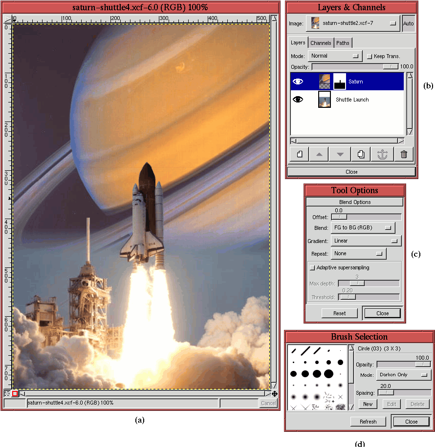
The result of this new mask is shown in
Figure
7.23(a).
Figure 7.23:
The Final Blended Image
 |
Figure
7.23(b) shows the corresponding
Layers dialog, Figure
7.23(c) shows the
Gradient tool's
Tool Options
dialog, and Figure
7.23(d) shows the
Brush Selection dialog (notice the choice of the
Darken
Only blending mode). This produces a lovely collage of the two
original images.
©2000 Gimp-Savvy.com
