Clicking on the Active Foreground Color or Active
Background Color patches in the Toolbox window (see
Figure
1.1(a)), brings up the Color
Selection dialog shown in Figure
1.4(a).
Figure 1.4:
The Color Selection Dialog
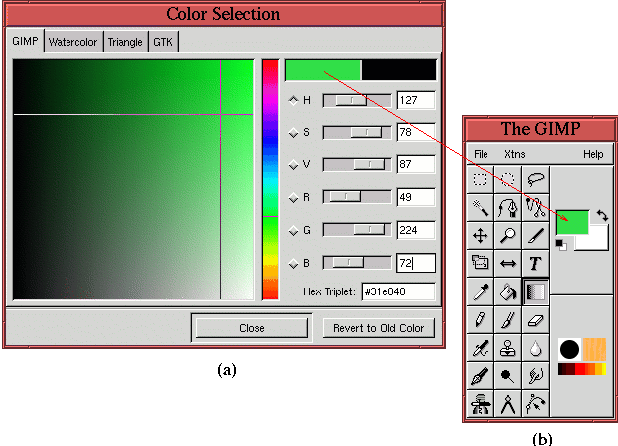 |
The rainbow-colored vertical bar is for choosing hue, and the large
colored square is for choosing saturation and value. A color choice
is made by clicking and dragging with the mouse to select the desired
hue, saturation, and value. Numerical values can also be entered for
R (red), G (green), B (blue), H (hue), S (saturation), and V (value)
in the data entry boxes. More on these color space components is
discussed in Chapter
5. Several other
color-choosing dialogs can be used by clicking on the tabs located in
the upper part of the window.
Choosing a color in the Color Selection dialog makes that color
appear in the Active Foreground Color or Active Background
Color patch (see Figure
1.1(a)), depending
on which patch was clicked to invoke the Color Selection tool.
Clicking the Swap Colors
icon (the two-headed arrow next to the active color patches) switches
the foreground and background colors. This can also be accomplished
by typing x in the image window. Clicking the Default
Colors icon (the small black and white
rectangles below the color patches) reverts the foreground and
background colors to their defaults of black and white. This can also
be accomplished by typing d in the image window.
Figure
1.5(a)
Figure 1.5:
The Brush Selection Dialog
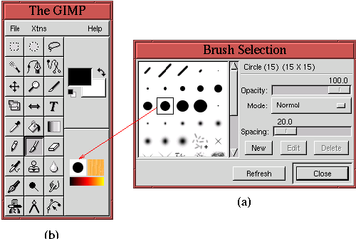 |
shows the
Brush Selection dialog.
This dialog can be displayed by clicking on the
Active Brush
icon in the Toolbox window. Clicking on a brush from the dialog makes
it appear as the new active brush in the Toolbox window, as shown in
Figure
1.5(b).
Figure
1.6(a)
Figure 1.6:
The Pattern Selection Dialog
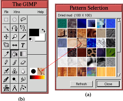 |
shows the
Pattern Selection dialog
. This dialog can be displayed by clicking on the
Active
Pattern icon in the Toolbox window. Clicking on a pattern from the
dialog makes it appear as the new active pattern in the Toolbox
window, as shown in Figure
1.6(b).
Figure
1.7(a)
Figure 1.7:
The Gradients Dialog
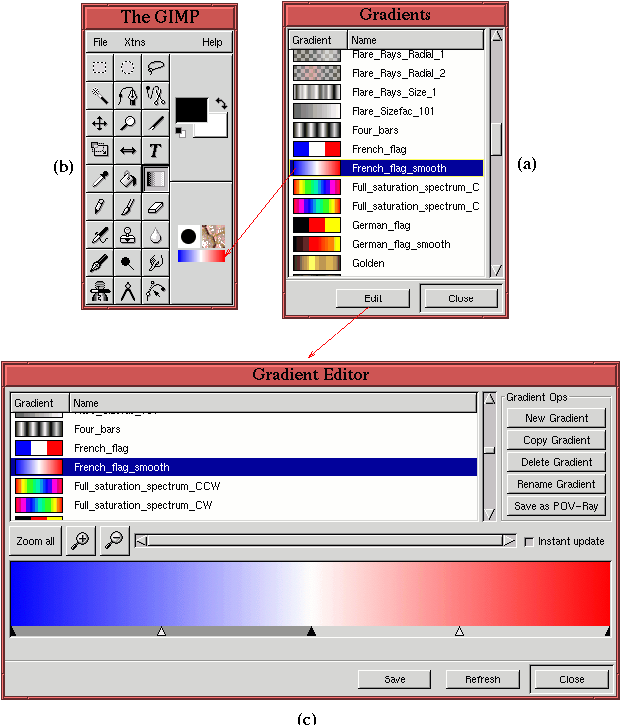 |
shows the
Gradients dialog.
This dialog
can be displayed by clicking on the
Active Gradient icon in the
Toolbox window. Clicking on a gradient from the dialog makes it
appear as the new active gradient in the Toolbox window, as shown in
Figure
1.7(b). Furthermore, custom gradients can
be created by clicking on the
Gradients dialog's Edit button.
This produces the
Gradient Editor, shown in
Figure
1.7(c).
Figure
1.8(a)
Figure 1.8:
The Color Palette Dialog
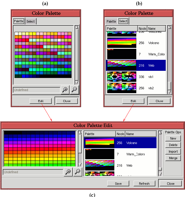 |
shows the
Color Palette dialog.
This dialog can be
displayed from the
Image:Dialogs menu or by typing
C-p in
the Toolbox window. The dialog consists of the Palette tab which
displays the active palette. Clicking on the Select tab allows you to
choose from a large number of predefined palettes, as shown in
Figure
1.8(b). In addition, you can create custom
palettes by clicking on the Edit button. This produces the
Color
Palette Edit dialog, shown in
Figure
1.8(c).
©2000 Gimp-Savvy.com
