To demonstrate the process of making charts and graphs in Calc, we will use the small table of data below.
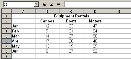
Table of data for charting examples
To create a chart, first highlight (select) the data to be included in the chart. The selection does not need to be in a single block, as shown below; you can also choose individual cells or groups of cells (columns or rows). See Chapter 1 (Introducing Calc) for more about selecting cells and ranges of cells.
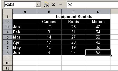
Selecting data for plotting
Next, open the Chart Wizard dialog using one of two methods.
- Select Insert > Chart from the menu bar.
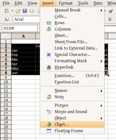
Insert chart from menu bar
- Or, click the Chart icon on the main toolbar.
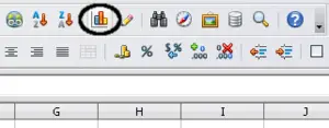
Insert chart from main toolbar
Either method inserts a sample chart on the worksheet, opens the Formatting toolbar, and opens the Chart Wizard, as shown
in the section below.
 | If you place the cursor anywhere in the area of the data, the Chart Wizard will do a fairly good job of guessing the range of the data. Just be careful that you have not included the title of your chart.
|