| |
Choosing a layout method
The best layout method depends on what the final document should look like and what sort of information will be in the document. Here are some examples. Do not worry if all this does not mean much to you now. The techniques mentioned are all described in this chapter.
|
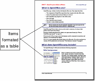
For a book similar to this user guide with one column of text, some figures without text beside them, and some other figures with descriptive text, use page styles for basic layout, and use tables to place figures beside descriptive text, when necessary.
|

|
|
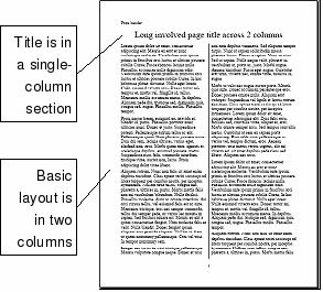
Use page styles (with two columns) for an index or other document with two columns of text where the text continues from the left-hand column to the right-hand column and then to the next page, all in sequence (also known as “snaking columns†of text). If the title of the document (on the first page) is full-page width, put it in a single-column section.
|

|
|
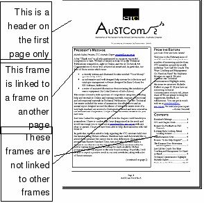
For a newsletter with a complex layout, two or three columns on the page, and some articles that continue from one page to some place several pages later, use page styles for basic layout. Place articles in linked frames and anchor graphics to fixed positions on the page, if necessary.
|

|
|
For a document with terms and translations to appear side-by-side in what appear to be columns, use a table to keep items lined up so you can type in both “columnsâ€.
|

|
|
|
