Donut charts
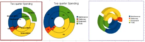
If you want to show the proportional nature of your data but want to include more than one data series, a donut chart is your best option. The extra layer attempts to give pies another dimension of time. However, two or three data series are all you can include before it becomes meaningless. The extra layer attempts to give pies another dimension of time.
As with pie chart, you can explode the pieces of the donut chart. You can also separate individual pieces as in pie charts.
Donut charts
As in pie charts, data labeling may be used a substitute for the legend, not an addition to it.