Bar charts
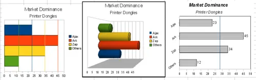
Three bar graph treatments.
Bar charts are excellent for giving an immediate visual impact for data comparison where time is not important, for example to compare the popularity of a few products in a marketplace.
- Graph one is achieved quite simply by using the chart wizard with Insert > Grids, un-check y-axis, and Insert > Mean Value Lines.
- Graph two is the 3D option in the chart wizard with a simple border and the 3D chart area twisted around.
- The third graph is an attempt to get rid of the legend and put labels showing the names of the companies on the axis instead. We also changed the colors to a hatch pattern.