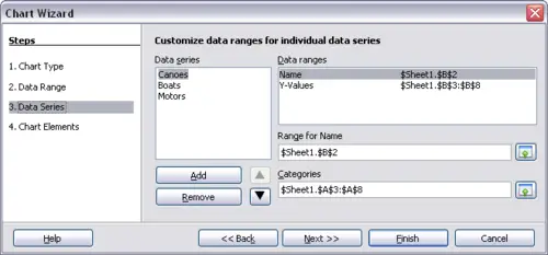
Selecting data series
On the Data Series page, you can fine tune the data that you want to include in the chart. Perhaps you have decided that you do not want to include the data for canoes. If so, highlight Canoes in the Data series box and click on Remove. Each named data series has its ranges and its individual Y-values listed. This is useful if you have very specific requirements for data in your chart, as you can include or leave out these ranges.
Amending data series and ranges
 | You can click the Shrink button
 next to the Range for Name box to work on the spreadsheet itself. This is handy if your data ranges are larger than ours and the Chart Wizard is in the way. next to the Range for Name box to work on the spreadsheet itself. This is handy if your data ranges are larger than ours and the Chart Wizard is in the way.
|
Another way to plot any unconnected columns of data is to select the first data series and then select the next series while holding down the Ctrl key. Or you can type the columns in the text boxes. The columns must be separated by semi-colons. Thus, to plot B3:B11 against G3:G11, type the selection range as B3:B11;G3:G11.
The two data series you are selecting must be in separate columns or rows. Otherwise Calc will assume that you are adding to the same data series.
Click Next to deal with titles, grids, and legends.