7.5.2 Color and Brightness Matching
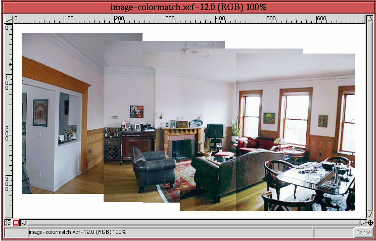
You can see that there is significant brightness variation from layer
to layer in Figure
7.35. This is normal for
photos taken with most consumer digital and regular film cameras.
These cameras typically auto-expose scenes according to average
lighting conditions and do not offer user controls for exposure. For
the image in layer A of Figure
7.35 the light,
coming from the windows is very bright which, due to the average light
metering of the camera, causes the features of the room's interior to
be underexposed. Thus, the room features in this layer are quite a
bit darker than in the other layers. Otherwise, the brightness of the
other layers are more or less consistent with each other.
In addition to the brightness mismatch between layers you can also see
from Figure
7.35 that there is a color balance
mismatch from layer to layer. The combination of color and brightness
variations means that the layer boundaries are plainly visible instead
of presenting a smooth and imperceptible transition across the
panorama.
The strategy for correcting the differences in brightness and color is
to use the Curves tool. The idea is to match color at
boundaries between layers using a method similar to that described in
Section
6.2.2. The method measures pixel values on both
sides of a layer boundary using the Color Picker tool. The Curves tool is then used to match the
values. This procedure corrects for both color and brightness
mismatch simultaneously.
Matching the color and brightness of two layers has a chain reaction
effect in a panorama project. Matching layer B to its neighbor A,
means that subsequently layer C must be matched to B, and so on.
Thus, some care must be taken to avoid blowing out the available tonal
range. Typically, the wisest decision is to choose the layer of
average brightness and to match the other layers working away from
this one. However, for this panorama project, it is layer E that is
chosen as the reference because its lighting for the room seems the
most natural. The work flow, then, is from the leftmost layer to the
rightmost, from layer E to layer A.
Starting with the boundary between layers E and D, a pixel value was
measured on the white wall just above the wood wainscoting. The
measured values are
177R 183G 194B to the left of the boundary
and
153R 156G 171B to the right. Using this information, the Curves tool is used on layer D to match the pixel values measured in
D to those of layer E. Representative pixels are then measured across
the boundary between layer D and layer C. Here, the measured pixel
values are located at the midway point between the hanging picture
and the ceiling molding. The values are found to be
179R 175G
185B to the left of the boundary and
112R 119G 139B to the
right. The Curves tool is employed again, this time on
layer C, matching C's pixel values to those of D's.
Continuing with the boundary between layers C and B, the measured pixel
values at a point midway between the mantle and the molding are
201R
197G 211B to the left and
101R 99G 112B to the right. The
final boundary is between layers B and A. Here the pixels are
measured at the midpoint between the plant and the molding. The
values found are
199R 198G 208B and
86R 75G 81B. The Curves tool is applied for each of these boundaries, as it was for
the first two.
The results of the color and brightness matching operations are shown
in Figure
7.37.
Figure 7.37:
Initial Color and Brightness Matching
 |
The overall color and brightness of the images in the layers are now
much more consistent. However, there continues to be sufficient
mismatch between the layers to perceive the layer boundaries.
Fortunately, this visual defect can be corrected using a layer
mask
blending technique described
in the next section.