5.2 The HSV Colorspace
The perception of color and our way of talking about it in everyday
life is not well served by the RGB colorspace. If we're thinking of
repainting the walls of the living room, for example, we usually think
about what shade of color it should be, how bright we want it, and
whether it should be pastel or vivid.
Typically, the first thing we usually notice about a color is its
hue. Hue describes the shade of color and where
that color it is found in the color spectrum. Red, yellow, and purple
are words that describe hue. Figure
5.3
Figure 5.3:
Hue, Saturation, and Value
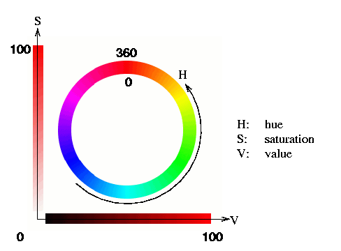 |
illustrates the range of hues, H, as a circle represented by values
from 0 to 360. The reasons for this will become clear shortly.
The next most significant aspect of color is typically the
saturation, S. The
saturation describes how pure the hue is with respect to a white
reference. For example, a color that is all red and no white is fully
saturated. If we add some white to the red, the result becomes more
pastel, and the color shifts from red to pink. The hue is still red
but it has become less saturated. This is illustrated in the vertical
bar of Figure
5.3. Saturation is a
percentage that ranges from 0 to 100. A pure red that has no white is
100% saturated.
Finally, a color also has a
brightness. This is a
relative description of how much light is coming from the color. If
the color reflects a lot of light, we would say that it is bright.
Imagine seeing a red sportscar during the day. Its color looks
bright. Compare this with the perception of the car as night is
falling. We can see that the car is red but it looks duller because
ambient illumination
is reflecting less light into the eye. Less light means the color
looks darker. In the GIMP, the most important measure of brightness
is measured by a quantity called value. However, there are also other
measures of brightness that will be introduced shortly. For the
moment, though, the horizontal bar in
Figure
5.3 illustrates a range of red values.
Value, like saturation, is a percentage that goes from 0 to 100. This
range can be thought of as the amount of light illuminating a color.
For example, when the hue is red and the value is high the color looks
bright. When the value is low it looks dark.
Thus, hue, saturation, and value are like an alternative colorspace.
Any color can be decomposed into these three components and, like for
RGB, it is possible to represent this space as a cube.
Figure
5.4
Figure 5.4:
Decomposing a Color Image into its HSV Components
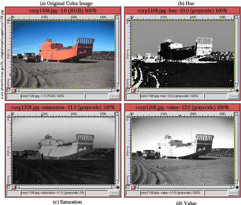 |
illustrates the result of using
Image:Image/Mode/Decompose on the color
image in Figure
5.4(a). Choosing the HSV
option in the
Decompose dialog produces the
hue,
saturation,
and
value
decomposition shown in
Figures
5.4(b), (c), and (d). It is
interesting to note that hue really doesn't change much. It is almost
constant over broad regions of the image. For, example, although
there is significant detail in the saturation and value components of
the sky, the hue is quite uniform there. Of the three, it is the
value component that is the most detailed.
Because colors are created on the monitor using mixes of red, green,
and blue, it is useful and instructive to see how the HSV colorspace
lives inside of the RGB cube.
©2000 Gimp-Savvy.com