Follow Techotopia on Twitter

On-line Guides
All Guides
eBook Store
iOS / Android
Linux for Beginners
Office Productivity
Linux Installation
Linux Security
Linux Utilities
Linux Virtualization
Linux Kernel
System/Network Admin
Programming
Scripting Languages
Development Tools
Web Development
GUI Toolkits/Desktop
Databases
Mail Systems
openSolaris
Eclipse Documentation
Techotopia.com
Virtuatopia.com
Answertopia.com

How To Guides
Virtualization
General System Admin
Linux Security
Linux Filesystems
Web Servers
Graphics & Desktop
PC Hardware
Windows
Problem Solutions
Privacy Policy


Eclipse BIRT Report Developer Guide
Previous Page Home Next Page

Previous Next

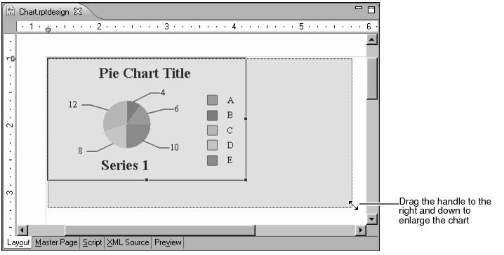
You usually need to enlarge a chart after you finish designing it in the chart builder. The size of the default pie chart cannot accommodate all the Classic Model data, so you resize the chart in the layout editor.

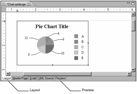
In earlier sections of this book, you also used the previewer in the report editor to preview how reports will look when you publish them. The Chart Preview in chart builder serves only as a guide for designing the chart and is not intended to show you exactly how your chart will look as a published report. You need to look at a preview in the report editor to ensure that the size of the chart is appropriate.

Figure 14-9 Chart element displayed in the layout editor

2
Choose Preview to preview the report in the report editor. The chart appears small, relative to the report page. Also in this case, the chart element is too small to accommodate all the legend data. The preview truncates the some of the labels and you cannot see Vintage Cars at all.

Figure 14-10 Preview of cramped chart before enlargement

3
To make the chart bigger so that all the data is visible and not so cramped, choose Layout, and enlarge the chart element to approximately 5 inches wide and 3 inches tall. To enlarge the chart, select it, then drag the handles that appear in the borders of the chart element, as shown in Figure 14‑11.

Figure 14-11 Enlarging a chart element

Figure 14‑11
4
Choose Preview to show the chart in the previewer again. The chart looks like the one shown in Figure 14‑12. Compare the preview in Figure 14‑12 with the preview in Figure 14‑10, where Vintage Cars data is not visible.

Figure 14-12 Preview of chart after enlargement

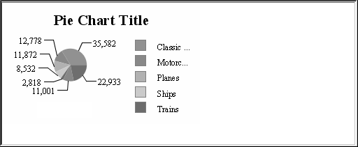
The chart now uses the correct data, but the layout is not very attractive. You need to format the chart to make it visually appealing and to emphasize the points that you want. The remaining procedures in this tutorial help you to modify the chart. Some of the changes that you make include creating a new title, adjusting the data labels, and removing the legend.


(c) Copyright Actuate Corporation 2009


  Published under the terms of the Eclipse Public License Version 1.0 ("EPL") Design by Interspire