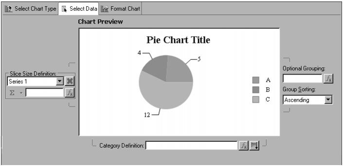
In task one, you created the data source connection and data set that you need. After selecting the data set to use, you must set up the expressions that the chart uses to represent the data graphically. Each type of chart uses data differently. For a pie chart, you must select data expressions that specify
The final published version looks more elaborate and complete, particularly if you choose to use live data for previews. In Chart Preview, the chart builder uses either live data from your data set or randomly generated sample data, depending on how you have set the Enable Live Preview preference.
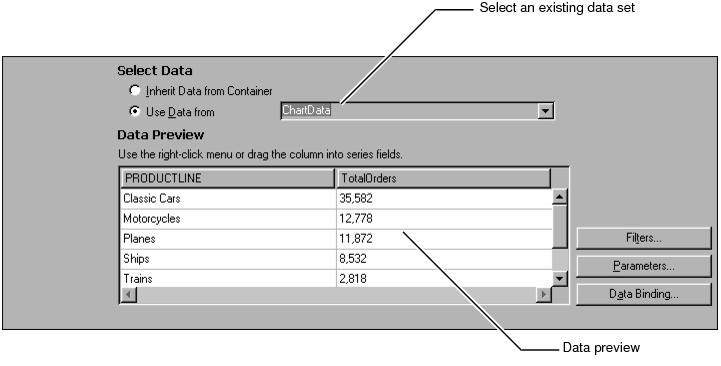
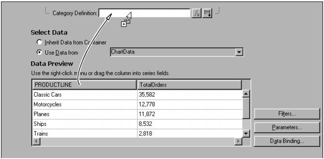
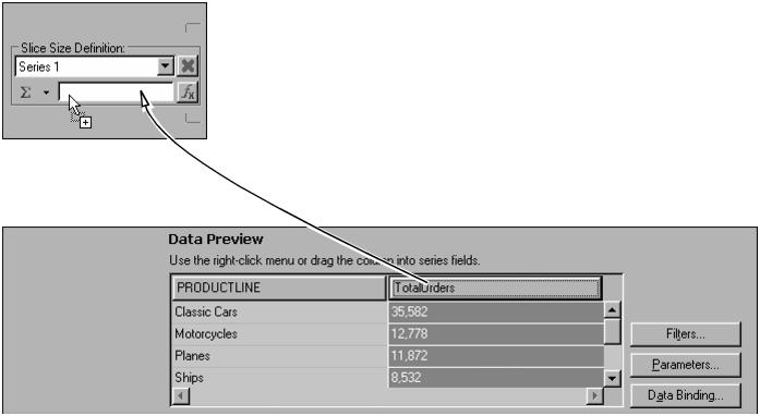
In Data Preview, the total orders column now appears colored to indicate that the column is used in the chart. The image in Chart Preview also changes to use the data you specified. The product lines have become the chart categories. Each sector represents one product line. The size of each sector represents the total orders for that product-line category.